An Adventure Outside the Comfort Zone
By Terry Strickland
Intro:
In this demo, I’ll be sharing my inspiration, motivation, step-by-step technique, and materials used to create, Scarlet in Winter, 20in x16in, oil on panel.
I brought this amaryllis with us when we moved from Florida to Alabama years ago. In late Winter, when it’s gray outside, its blooms are a bright spot of sunshine in our home.
My passion lies in painting figures and faces, but I’ve always thought I’d like to tackle this beauty. Recently it occurred to me to do a figure painting featuring amaryllis. Studies outside my comfort zone were called for!
Step 1: Set-up, composition, and Block-in
I moved the flowers from the foyer to the studio and introduced a little drama by adding a spotlight and a dark backdrop.
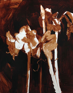
I chose a composition and began painting with Burnt Umber thinned with a bit of odorless mineral spirits (OMS). I used a #2 filbert, drawing lines to locate the stalks and flowers in the composition.
Next, I laid in the shadow areas using thicker paint. Rembrandt Oils are formulated to have the perfect consistency straight out of the tube, so I rarely use a medium. When I do it’s a 50/50 combination of linseed oil and OMS.
Step 2: Drawing and Value Map
I created a map of the values that will be a guide when color is added. At this stage, my painting technique was a combination of adding paint with a large bristle fan brush or removing paint by rubbing out areas of light with a soft cloth rag.
When I paint, I think of purposeful mark-making rather than filling in my drawing. It’s a subtle shift in thinking but makes for more expressive brushwork and accuracy. I concentrated on modifying shapes from loose and general to more specific.
Step 3: Color
I mixed green and red color strings, consisting of at least three values of each. I painted the stems and flowers in the back first. The last thing painted visually pops forward, so I saved the foreground for last.
When painting individual forms, I painted the dark first and worked toward the light. I kept the values in a close, dark range in the shadows. That way they seemed to fall away from the light and into the background.
I worked in adjacent areas while the paint was wet so I could get soft edges. This enables the forms to meld into each other, integrating with the environment.
Step 4: Wrangling Reds
Reds can be tricky to paint and unless a pink flower is your aim, it’s best to avoid white. A better solution is to change pigments or modify with colors other than white.
I used Scarlet, semi-opaque, and Permanent Madder Deep, semi-transparent; and added other mostly transparent colors such as Ultramarine Blue Deep, Viridian, or Phthalo Green Blue to darken or subtly neutralize the chroma in the shadows. I switched to more opaque pigments such as Cadmium Reds and Oranges in the areas of light.
Step 5: Using Transparency and Opacity with Purpose
Using more transparent pigments in the shadows and more opaque paint in the light is what gives oil paintings a luminous quality similar to stained glass.
Think of a pool of water glowing from its depths versus the light glinting off its surface. As forms turn into the light and the paint becomes more opaque an illusion of three dimensions is created.
This idea is an important concept I consider in every painting. When someone describes a painting as chalky it’s a clue that the shadows have too much opacity.
More about Transparency VS Opacity: Know Your Paint, Check the Labels
On the Rembrandt Oil tubes I use, there are small squares that indicate the specific transparency level of that pigment or combination of pigments. Most oils have a code or say right on the label.
 |
| left to right, transparent, semi-transparent, semi-opaque, opaque |
On Varnishing: Yes, Always!
I use a varnish on my paintings that contains a UV filter. It protects the surface from dust, scratches, and light, as well as giving the surface a beautifully uniform finish. I wait 3-6 months and pre-varnish with a very thin layer of 50/50 Galkyd/Gamsol. I let that dry for a few days, then apply 1-2 layers of gloss Gamvar, which is formulated to be used as soon as the paint is dry to the touch.
Materials:
Rembrandt Oil Colors by Royal Talens
Burnt Umber
Titanium White
Cad Yellow Medium
Yellow Ochre
Transparent Oxide Yellow
Cadmium Orange
Transparent Oxide Orange
Scarlet
Cadmium Red Light
Cadmium Red Med
Permanent Madder Deep
Permanent Red Violet
Ultramarine Blue Deep
Kings Blue
Phthalo Green Blue
Viridian
SapGreen
Silver Brush Company
Ruby Satin- Filberts #2,4 Flat #6
Silverstone- Fan #6,#2
Gamblin
Refined Linseed Oil
Gamsol (odorless mineral spirits, OMS)
Galkyd
Gamvar (gloss)
RayMar Oil Primed Belgian Linen Panel
Artists & Illustrators Magazine Article: I was delighted to be asked to write about my process for Artists & Illustrators Magazine. A slightly shortened version of this blog post appears in their December 2018 issue.
www.terrystricklandart.com


