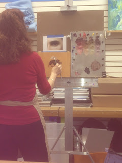
It's all about the eyes and mixing flesh tones this week.
This a project I'm doing with the oil painting class I teach on Tuesday mornings at Forstall Art Center in Birmingham, AL. We are doing small studies of each facial feature. Eventually we will do a complete portrait with the skills gained by studying the features individually. Here's
Part 1 in which I drew the eye.
In the last post, the painting was at this stage. My disclaimer here is that this is just what I do. There are many different methods out there but this is what I have developed over the years. It works for me.
I am constantly trying new things but for now this is my go-to starting place. I develop 4 basic flesh tones. Having a method helps me and seems to help my students.
 |
| This is my standard palette. |
 |
Rembrandt brand oil colors, left to right
1. (yellow ochre, scarlet red, permanent matter deep),
2. (yellow ochre, scarlet, chromium oxide green, cobalt/ultramarine).
3. (yellow ochre, scarlet, chromium oxide green, transparent orange oxide),
4. (yellow ochre, scarlet, chromium oxide green, cobalt/ultramarine blue, permanent matter deep)
|
 |
| They become what I think of as a pink flesh, a golden flesh, a green flesh and a putty flesh. |
 |
Separately, I mix up a warm dark for modifying the flesh color in the shadows. It is burnt umber, a bit of transparent oxide orange and permanent matter deep. I like this combination since it is very transparent. I can always cool it down later by adding some blue or green (something transparent or semi transparent like the thalos or viridian)
|
 |
I then place a bit of the dark mixture above each color pile leaving some room between it and the base colors I just mixed.
|
 |
| I then mix a little of my base colors with the dark to get a light shadow. |
 |
Notes:
~Next I add white to the base colors to get two lighter tones. So I end up with 4 strings of 5 values each.
~It is important that I only mix from the base color up adding the dark mixture to get my shadow colors AND
~Work from the base color down adding white.
~This keeps white from polluting my shadows and allows them to stay transparent.
~If I'm using a dark mix and decide it is too dark I add more of the base color NOT white. This prevents the shadows from getting chalky.
|
 |
~I begin with the darkest, deepest area, the crease in the eyelid.
Notes for using this palette layout:
~If I'm painting a light mix and want it darker I add more of the base color not the dark brown mixture.
~When I'm painting an area with a certain value, I move sideways on the palette. For example, if the area on the painting I'm moving to is the same value but greener I'll just slide over and grab a little bit of the green flesh tone that's the same value. If it's the same value but pinker I'll slide over and grab a bit of the pink flesh from the same value line.
|
 |
| Squint to see shadow shapes. |
 |
~Paint on a bit of the lightest area, (not the highlight, that's last). In this case the area above the eyebrow, a cool light flesh color.
~This gives you a range of color from the darkest to the lightest. Everything will now be judged in relation to these two color/value points of reference.
|
 |
~I paint in planes, adding facets of color where I see them, trying to match value and pushing the color.
~By that I mean that I make it as colorful as I see it and then some. I can always dull it down by adding a neutral or an opposite color later on but it's hard to get back to pure color when it gets too muddy at the start.
|
 |
~I have aded a bit of cad red to pump up the color under the brow and under the lower lid.
~The white of the eye is basically a cooler flesh tone. I added cobalt/ultramarine to achieve that. |
 |
~Closing in now, I smudge the planes of color together a little bit, softening edges.
~If I planned to work on the painting for a second pass I'd make sure there were no big ledges of paint left by brush strokes.
~Big ledges left behind are problematic if you decide to move a line later.
|
 |
| Actually I couldn't resist working on it a bit more. I refined the shape of the iris, toned down the reds under the brow, and worked on the eyebrow a bit. There is a lot more I could do but it's just a study so I'm calling it done. |
(Thanks for the demo pictures from class Jeanine!)


This looks great..I love how vibrant the colors are and yet how realistic at the end. For someone who's never painted before, do you recommend a simpler palette?
ReplyDeleteThank you Becca. There are limited palettes you could work with if you just wanted to get your feet wet but I say jump in. This palette is a good combination of modern archival pigments and earth tones. There is a transparent and more opaque of each color, and generally a warm and cool of each color. This is actually my more limited palette. I add a few extra colors fairly often. Thanks for being a reader and happy painting!
ReplyDeleteThanks for posting this Terry! This is the best explaination I've seen for mixing up believable skintones. I've had a teacher mix up a similar group of base colors, but didn't explain how she got them. I found it very confusing. The way you are showing it makes total sense. Your students are lucky to have such a good teacher!!
ReplyDeleteGlad you enjoyed it Laura and that it was helpful to you. Thanks for letting me know and thanks for reading!
ReplyDeleteThis is very generous of you to share your expertise with us. I don't think there is any danger of me overtaking you. Your work is excellent!. Birmingham Journal of Arts has many excellent works. I bought a piece by James Knowles modeled after the cover he did for the BAJ 3-4. I love it. At one time I dabbled. I've never quite shed the bug and I really appreciate what you sharing her. Thank you.
ReplyDeleteJD, My pleasure, I'm so glad you are enjoying the blog. The Journal is fun. Are you from B'ham then?
ReplyDeleteHi Terry, Thanks for your tutorial. I was just wondering do you use Yellow Ochre or Yellow Ochre Light in the Rembrandt Talens range?. In the photo it looks very light for a yellow ochre. Also, when you are doing studio work, do you start with toned ground or an underpainting?.
ReplyDeleteLove your work,
Best Wishes,
Sam (Australia)
Hi Sam, Thanks for reading. It is yellow ochre, Rembrandt. Most of the time in the studio I start with a white canvas and do a burnt umber rub out underpainting. Allow that to dry then go in with first pass of color. Thank you, Terry
ReplyDeletePS, here is a link to a post i did about it. http://terrystricklandart.blogspot.com/2011/03/underpainting-demo.html